IN FOCUS
Viva Magenta
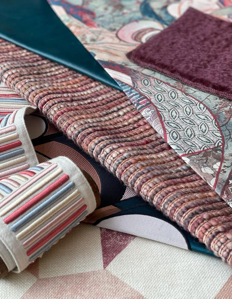
clockwise from top leaf: Altfield-Richmond-Petrol | Texture-Ascot-Teal | Thesign-Adagio-Merlot | Weitzner-Altitude-Warm | Brochier-Aalto-Rosa | James Malone-Borodin-Soft | Texture-Amboise-Multi
This year Pantone drew inspiration from the vibrancy of nature for their Colour of the Year – Viva Magenta. A rich hue that makes a powerful statement. This unique colour is the perfect blend of blue and red, a true chameleon it can be both warm and cool toned depending on how it is used within an interior.
“It’s brave, it’s fearless, it depicts optimism and joy – and we know that we are all greatly in need of that”
Leatrice Eiseman, executive director of the Pantone Color Institute
We can’t wait to see how this colour is incorporated into the interiors sphere!

Brochier-Filippo

James Malone-Caspian

Brochier-Puffo

Jannelli & Volpi-Amalfi

Brentano-Jinx

Brentano-Quill